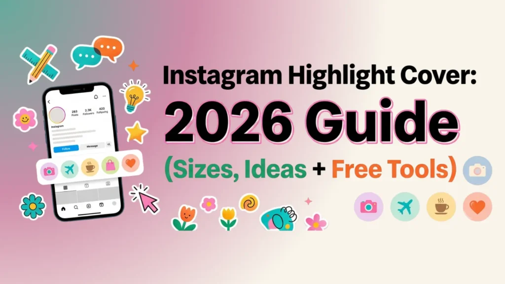
Your Instagram bio gets eight seconds of attention. Your Instagram highlight cover row gets the next three. That tiny strip of circles below your bio is the most underrated piece of profile real estate on the platform, and most accounts waste it with default screenshots or random faces.
In this guide, you will learn the exact Instagram highlight cover size for 2026, see fresh design ideas you can copy in minutes, and follow simple steps to add covers that actually convert visitors into followers. We have also built a quick framework called the 4-C System to help you design covers that look professional, even if you have never opened a design tool.
Let us get into it.
What Is an Instagram Highlight Cover?
An Instagram highlight cover is the small circular thumbnail image that represents a saved Story collection on your profile. Instead of showing a random frame from one of your old Stories, a custom cover gives that highlight a clean, branded look.
Highlights live permanently below your bio. They tell new visitors what kind of content you publish, what your brand stands for, and what they will get if they follow you. A well designed Instagram highlight cover does three things at once:
- Organises your past Stories into clear categories
- Builds visual consistency across your profile grid
- Encourages visitors to tap and explore (which Instagram reads as engagement)
Think of it as a website navigation menu, but for your Instagram profile.
Why Instagram Highlight Covers Matter More in 2026
A few years ago, highlights were optional. In 2026, they are essential. Here is why:
- Profile decisions happen fast. Most users decide whether to follow within seconds, and the highlight row is one of the first elements the eye lands on after the bio.
- Search visibility is shifting. Instagram now indexes Story titles and content for in-app search, so well organised highlights help discoverability.
- Trust signals matter. Branded covers tell visitors that the account is run by someone who takes their presence seriously. That alone separates you from 80% of profiles in any niche.
- Local businesses benefit even more. A coffee shop in Karachi or a yoga studio in Austin can use highlights to show menu items, reviews, FAQs, and directions without making the visitor scroll through years of posts.
If you are already investing time in Reels and feed posts, ignoring your highlight covers is leaving conversions on the table.
Instagram Highlight Cover Size: The Right Dimensions for 2026
This is the most asked question, and most articles get it slightly wrong. Here is the clean answer.
Recommended Size
- Dimensions: 1080 x 1920 pixels
- Aspect ratio: 9:16
- Display size: Instagram crops the centre into a circle of roughly 110 x 110 pixels on mobile
- Safe zone: Keep the actual icon or text inside a centred 600 x 600 pixel area
- File format: PNG for icons and flat graphics, JPG for photos
- File size: Under 5 MB for crisp upload quality
Why 1080 x 1920 and Not Square?
Some older guides suggest a 2000 x 2000 square. While that works, designing at 1080 x 1920 gives you two advantages: the file matches Instagram Story dimensions exactly, so you can also post the cover as a Story without resizing, and Instagram applies less compression when the dimensions already match the platform standard. Less compression equals sharper visuals.
Common Size Mistakes to Avoid
- Using your feed post size (1080 x 1080) and watching the design get awkwardly zoomed
- Designing the icon all the way to the edges of the canvas, only to have Instagram crop the corners
- Saving as a low resolution JPG and getting blurry circles on retina screens
If you remember one thing from this section, remember the safe zone rule: anything important goes in the centre 600 x 600 pixels.
The 4-C Framework for Designing Instagram Highlight Covers
Most design articles throw 50 templates at you and call it a day. The problem is that templates without a system produce inconsistent profiles. We use this 4-C framework with our clients at Leemjaz, and it works whether you are a personal brand, a product business, or a service provider.
1. Consistency
Pick one visual rule and apply it across every cover. That rule can be:
- A single background colour (the same shade of beige, navy, or pink across all covers)
- A single icon style (line icons, filled icons, or hand drawn)
- A single font (one weight, one family)
Inconsistency is the number one reason highlight rows look unprofessional. If three covers use icons and three use photos, the eye reads chaos.
2. Clarity
Your highlight cover is roughly the size of a fingertip. That is not the place for paragraph text. Use:
- One icon, or
- One word (max 6 to 8 characters), or
- One simple symbol
If a stranger cannot understand the cover in half a second, simplify it.
3. Colour
Colour ties your highlights to your overall brand. The simple test: open Instagram, look at your three most recent posts, and pull two colours from them. Use those two colours as the foundation of every cover. This creates a profile that feels designed even if every individual element is simple.
4. Concept
This is the part most accounts skip. Before you design, decide what each highlight is for. Common concepts include:
- About me or About us
- Services or Shop
- Reviews or Press
- FAQs
- Behind the scenes
- Tutorials or Tips
- Contact or Booking
- Press or Features
Match the cover icon to the concept. A shopping bag for Shop, a star for Reviews, a question mark for FAQs. The icon should make the category obvious before the visitor even reads the label.
When you combine all four Cs, your profile will look like it was designed by an agency, even if you put it together on your phone in twenty minutes.
Instagram Highlight Cover Ideas (Sorted by Niche)
Here are battle tested ideas across the most common Instagram niches. Pick the set that fits your account.
For Local Businesses
- Menu with a fork and knife icon
- Hours with a clock icon
- Location with a pin icon
- Reviews with a star icon
- Specials with a tag icon
- Team with a people icon
A bakery in Lahore or a salon in Dubai can use these six covers and instantly look more credible than competitors who skip the step.
For Personal Brands and Creators
- About with a small portrait or signature
- Tips with a lightbulb icon
- Press with a microphone or quote icon
- Q&A with a question mark
- Free Stuff with a gift icon
- Work With Me with a handshake icon
For E-Commerce Brands
- Shop with a bag icon
- New with a sparkle icon
- Sale with a tag or percentage icon
- Reviews with a star
- How To Use with a play icon
- Shipping with a truck icon
For Coaches and Service Providers
- Services with a briefcase
- Results with a chart icon
- Free Training with a play icon
- Book A Call with a calendar icon
- Testimonials with quote marks
- About with a portrait
Aesthetic Themes That Work in 2026
If you want a more visual look instead of icons, here are aesthetic directions performing well right now:
- Soft minimalist: Cream background, thin black line icons, lowercase serif text
- Y2K revival: Glossy gradients, chrome textures, bold rounded fonts
- Editorial black and white: High contrast photos, white sans serif labels
- Botanical: Sage green backgrounds, hand drawn leaves, ivory text
- Retro warm: Burnt orange, mustard, and brown palette with grainy texture
Whatever direction you pick, apply it to all covers. A mixed aesthetic looks worse than a plain default cover.
Best Free Tools to Make Instagram Highlight Covers
You do not need Photoshop. These free tools handle everything:
- Canva. The fastest option. Search “Instagram highlight cover” in templates, pick a set, edit text and colour in two minutes. Mobile and desktop both work.
- Adobe Express. Strong for brand consistency because you can save brand colours and fonts in a free brand kit.
- Fotor. Good if you want pre-made icon sets without doing the design yourself.
- Snappa. Clean interface and pre-sized templates already at 1080 x 1920.
- Figma. The choice if you want full control and plan to design dozens of covers across multiple client accounts. Free community templates are available.
For most users, Canva is the best balance of speed and quality. Pick it unless you have a specific reason to use something else.
How to Add an Instagram Highlight Cover (Step By Step)
Once you have your cover designed and saved to your phone, here is how to apply it.
If You Are Creating a New Highlight
- Open Instagram and go to your profile
- Tap the plus icon, then tap Story Highlight
- Select the archived Stories you want to include, then tap Next
- Tap Edit Cover
- Tap the small photo icon at the bottom
- Select your custom cover from your camera roll
- Pinch to centre your design inside the circle preview
- Add a short title (one or two words works best)
- Tap Add
If You Are Updating an Existing Highlight
- Go to your profile and tap the highlight you want to change
- Tap the three dots in the bottom right corner
- Tap Edit Highlight
- Tap Edit Cover
- Tap the photo icon and select your new design
- Adjust the centre point so the icon is perfectly framed
- Tap Done
The whole process takes under thirty seconds per highlight once your covers are designed.
Common Mistakes That Hurt Your Profile
Even great covers fail when paired with these mistakes:
- Too many highlights. Anything past nine starts to look cluttered on most phones. Six to nine is the sweet spot.
- Clickbait labels. “OMG must see” tells the visitor nothing. “Reviews” or “Menu” wins every time.
- Mixing styles. Three icon covers next to three photo covers ruins the rhythm. Pick one approach and stick with it.
- Tiny low contrast text. If you are squinting at it on your own phone, every visitor will scroll past it.
- Forgetting mobile. Always preview on a phone, not a desktop browser. Highlights are a mobile first feature.
Pro Tips for Local Businesses
If you run a local business in a city like Karachi, Dubai, London, or New York, your highlights are a free local SEO tool. Here is how to maximise them:
- Use a Location highlight with your pin and exact address inside
- Add a Hours highlight that you update for holidays
- Create a Today highlight that you refresh daily with current specials or stock
- Pin a Reviews highlight near the front of your row
- Use your highlight titles as keyword opportunities. “Best coffee Lahore” reads better than “Coffee” if you want local search relevance
Local businesses that treat highlights like a mini website often see noticeably higher save and share rates on their Stories.
Frequently Asked Questions
What is the best Instagram highlight cover size?
The best Instagram highlight cover size is 1080 x 1920 pixels at a 9:16 aspect ratio. Instagram will crop the cover into a circle of about 110 x 110 pixels, so keep all important design elements inside the centre 600 x 600 pixel area.
Can I use a photo as my Instagram highlight cover?
Yes. Any image from your camera roll can be used as a highlight cover. For best results, choose a photo with a clear central subject and high contrast, since Instagram will crop the corners off when it forces the circle shape.
Do Instagram highlight covers help with SEO?
They do not directly affect Google search, but they help your in-app discoverability. Clear highlight titles and consistent visuals encourage profile visits to convert into follows, which signals quality to the Instagram algorithm and indirectly improves reach.
How many Instagram highlight covers should I have?
Six to nine highlights work best. Anything beyond nine starts to look cluttered and many viewers will not scroll horizontally to see the rest. Pick the categories that matter most to your audience.
Are Instagram highlight covers free to make?
Yes. Tools like Canva, Adobe Express, Fotor, and Snappa all offer free templates and editors for Instagram highlight covers. You do not need a paid plan to design professional looking covers.
Why does my Instagram highlight cover look blurry?
Blurry covers usually come from one of three problems: the source image is below 1080 x 1920 pixels, the file was saved as a low quality JPG, or the file size is too large and Instagram compressed it heavily. Re-export at 1080 x 1920 as a PNG to fix the issue.
Can I change my Instagram highlight cover later?
Yes. You can update any highlight cover at any time. Tap the highlight, tap the three dots, choose Edit Highlight, then Edit Cover, and upload a new design from your camera roll.
Final Thoughts
Your Instagram highlight cover is a small element with an outsized impact. Get the size right (1080 x 1920), apply the 4-C framework (Consistency, Clarity, Colour, Concept), and refresh your covers whenever your brand evolves. Visitors notice. The algorithm rewards engaged profiles. And you start to look like a brand instead of an account.
If designing covers is one more task on a list that already feels too long, Leemjaz can build a complete branded highlight set for you as part of our social media marketing service, alongside content strategy, posting, and analytics. Get in touch with our team and we will take it off your plate.
Looking for more Instagram growth tactics? Explore our guides on Instagram username ideas and Instagram content ideas for local businesses next.