Instagram has transformed from a simple photo-sharing app to a global social media powerhouse, and with this growth, its visual identity has become an essential part of its brand. One key aspect of this identity is the typography, specifically what font Instagram uses. Whether you’re a casual user, a business, or a content creator, understanding this font is crucial to grasping how the platform maintains its sleek, user-friendly experience.
In this article, we’ll answer the question: What font does Instagram use? along with other common queries about the fonts that appear on the platform, how Instagram customizes them for different contexts, and how you can use similar fonts to enhance your own Instagram branding.
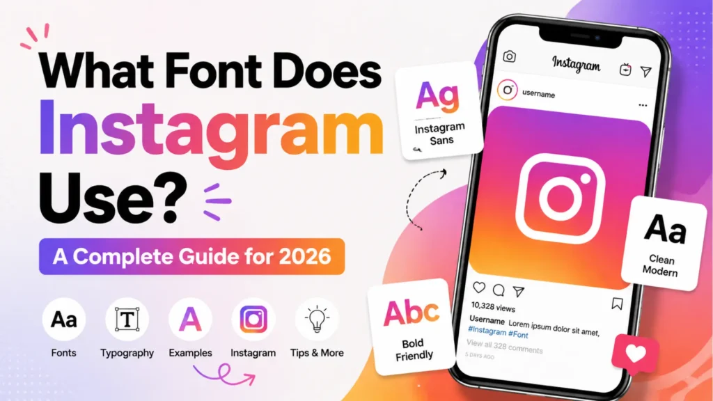
The Global Brand Identity: Instagram Sans
The most significant shift in the platform’s history was the introduction of Instagram Sans. Launched as part of a major rebrand, this proprietary typeface replaced old favorites like Proxima Nova to create a unified experience.
Why was it created?
Instagram wanted a font that felt as smooth as their Squircle logo. Designers took the rounded curves of the app icon and applied them to every letter.
- Variable Font Technology: Instagram Sans is variable, meaning a single file can act as thin, bold, or light.
- Global Accessibility: It was built with linguists to support over 40 scripts, ensuring that the brand looks identical whether you are in Tokyo, Dubai, or New York.
A Brief History: From Retro to Modern
To understand why Instagram looks the way it does now, we have to look back.
- The 2010 Era (Nostalgia): The original Instagram logo used a script called Billabong. It reflected the app’s early vintage camera aesthetic.
- The 2016 Shift (Minimalism): Instagram moved toward a flatter design, adopting Proxima Nova for its web interface and San Francisco for iOS.
- The 2022-2026 Era (Identity): Instagram Sans took over. It represents a full circle moment, pairing the friendliness of a script with the precision of a modern sans-serif.
What Font Does Instagram Use?
Instagram uses a combination of custom fonts for its brand identity and system fonts for in-app text, depending on the device. Here’s a breakdown:
- Instagram Sans: Instagram’s custom typeface, used for brand elements and the logo.
- SF Pro (San Francisco): The system font used on iOS devices for captions, bios, and other text within the app.
- Roboto: The system font used on Android devices for captions and other text elements.
What Font Does Instagram Use for Captions?
Captions on Instagram are displayed using the system fonts of the device you’re on:
- iOS: Instagram uses SF Pro (San Francisco) for captions, which aligns with Apple’s default system font. SF Pro is clean, modern, and highly legible on smaller screens, making it ideal for mobile viewing.
- Android: For Android users, Instagram uses Roboto, a neutral and widely-used font designed for readability on Android devices. Roboto has become a standard font for many Android apps due to its versatility and legibility.
Both fonts are simple, sleek, and optimized for reading on mobile devices, ensuring that captions are clear and easy to read in both light and dark modes.
What Font Does Instagram Use for Stories?
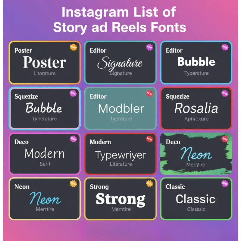
The 2026 Story & Reels Font List (All Styles)
Instagram recently expanded the “Create” menu. To rank as a pro, you must know these fonts by their official names. Each one is designed for a specific vibe:
The Aesthetic Newcomers
- Poster: A bold, high-contrast serif. This is currently the most popular font for high-fashion Reels in 2026.
- Signature: A light, handwritten cursive that looks like a personal note.
- Editor: A sophisticated, wide-spaced serif for editorial looks.
- Bubble: Fun, rounded, “puffy” letters for Gen-Z content.
- Squeeze: A compressed, tall font for “loud” announcements.
- Deco: A confident, Art Deco-inspired style.
The Reliable Classics
- Literature: A classic book-style serif for long quotes.
- Modern: The sleek, all-caps default used for clean designs.
- Neon: A glowing script meant to mimic real neon signs.
- Typewriter: A nostalgic monospaced font for storytelling.
- Meme (Strong): The heavy, high-impact font used for humor.
The Secret Easter Egg: To unlock the hidden Papyrus font, select the “Meme” font and type “Papyrus.” It still works as of 2026!
Why Fonts Matter for Your Reach
Once you’ve updated your brand’s fonts, you might notice your engagement shifting. If your reach feels stuck despite your new look, it might be time to reset your Instagram algorithm to ensure your fresh aesthetic reaches the right audience. Furthermore, many creators find that combining a great visual style with a base level of social proof helps them grow faster. If you’re starting from scratch, many look into trusted sites to buy Instagram followers as a way to kickstart their profile’s credibility alongside their new design strategy.
What Font Does Instagram Use for Messages?

Instagram’s Direct Messages (DMs) also rely on system fonts:
- iOS: For iPhone and iPad users, Instagram uses SF Pro in Direct Messages, ensuring consistency with the iOS interface.
- Android: On Android devices, Instagram uses Roboto, providing a seamless user experience across the platform.
These fonts are designed for readability, ensuring clear communication between users without distracting from the conversation itself.
What is the Closest Font to Instagram’s Typeface?
If you’re looking to replicate Instagram’s custom font, Instagram Sans, for your own branding or content, there are a few fonts that offer a similar feel:
- Proxima Nova: Often considered the closest alternative to Instagram Sans, Proxima Nova has a similar clean, modern appearance, and it’s widely used in web design.
- Helvetica Neue: This font shares a minimalist design and can closely resemble Instagram Sans in a more neutral style.
- Open Sans: For those looking for a free alternative, Open Sans offers readability and a simple, modern feel, similar to Roboto.
These alternatives provide designers with a similar aesthetic to Instagram Sans or the system fonts used on the platform, giving them a consistent look for Instagram-related branding.
Why Instagram Uses Custom and System Fonts
Instagram’s decision to use Instagram Sans for branding and SF Pro/Roboto for the user interface comes down to a balance of aesthetic appeal and functionality:
- Instagram Sans enhances the app’s identity and reinforces its modern, minimalist design ethos. It’s used in marketing, the logo, and brand materials, making it an integral part of Instagram’s overall look and feel.
- SF Pro (iOS) and Roboto (Android) are system fonts chosen for their legibility and ease of reading. These fonts are optimized for mobile devices, ensuring Instagram’s text remains readable, whether you’re viewing captions, bios, or messages.
Instagram’s approach to typography ensures that the app provides a seamless, consistent user experience across both platforms while retaining a distinctive, recognizable visual identity.
How Instagram Fonts Impact User Experience and Branding
The choice of fonts on Instagram isn’t just about aesthetics, typography plays a crucial role in the app’s user experience. Here’s why:
- Legibility and Readability: Fonts like SF Pro and Roboto are chosen for their clarity on mobile screens, ensuring that users can read captions, bios, and messages without strain.
- Consistency: By using system fonts for user interface text, Instagram ensures a consistent experience for users on both iOS and Android, regardless of device.
- Brand Identity: Instagram Sans contributes to Instagram’s unique brand identity, setting it apart from other social media platforms and giving it a distinct, modern aesthetic.
How to Use Instagram’s Fonts for Your Own Branding
If you want your website or ads to match the Instagram aesthetic, here are the closest free alternatives available on Google Fonts:
- For Instagram Sans: Use Inter or Instrument Sans. Both are free and share the “geometric-meets-grotesque” style.
- For the Story “Editor” font: Use JetBrains Mono.
- For the Story “Poster” font: Use Gravitas One.
- For the “Signature” font: Use Marck Script.
Conclusion: What Font Does Instagram Use?
To sum it up, Instagram uses Instagram Sans for branding, while default system fonts like SF Pro (iOS) and Roboto (Android) are used for in-app text such as captions, bios, and messages. Instagram also offers a range of font styles for stories, allowing users to customize their content to suit their creative needs.
By understanding how Instagram uses fonts, you can better tailor your own content to reflect your brand identity and make the most of Instagram’s design options. Whether you’re crafting engaging captions, creating unique stories, or communicating with your audience through DMs, fonts play a significant role in enhancing your experience and connection with others on the platform.
FAQs: What Font Does Instagram Use?
Q1: Can I use Instagram’s exact font in my posts?
Instagram’s font, Instagram Sans, is proprietary, but similar fonts like Proxima Nova or Helvetica Neue can be used to replicate a similar look.
Q2: Does Instagram allow font changes for regular posts?
Instagram doesn’t allow custom fonts for regular posts. However, you can change the font in Instagram Stories using the built-in text tools or third-party apps.
Q3: Is Instagram Sans the same font used in the logo?
Yes, Instagram Sans is used in both the logo and other brand materials, but the text in the app’s user interface is either SF Pro (iOS) or Roboto (Android).